Squarespace Website Design for a Yoga Teacher UK — Yoga Prema Brand & Website Case Study
Why This Yoga Teacher Needed a New Brand and Squarespace Website
Lila Conway has been teaching yoga for nearly thirty years. She spent years living and studying in traditional ashram settings in India, has guided thousands of students through Hatha yoga, pranayama and Yin practice, and leads retreats in Kerala and the Greek islands. By any measure, she is an experienced, deeply rooted yoga teacher with a body of work that speaks for itself.
But her website didn't show any of that.
When Lila came to me, she said something that stopped me in my tracks: "My current website is holding me back. I don't feel comfortable inviting people to it." She was turning down opportunities, holding back from promoting her retreats, and quietly shrinking her visibility — not because her work wasn't ready, but because her brand wasn't reflecting it.
She initially came to me for a new website. It quickly became clear she needed something bigger: a complete rebrand that finally matched the depth, warmth and quiet authority she brings to everything she teaches.
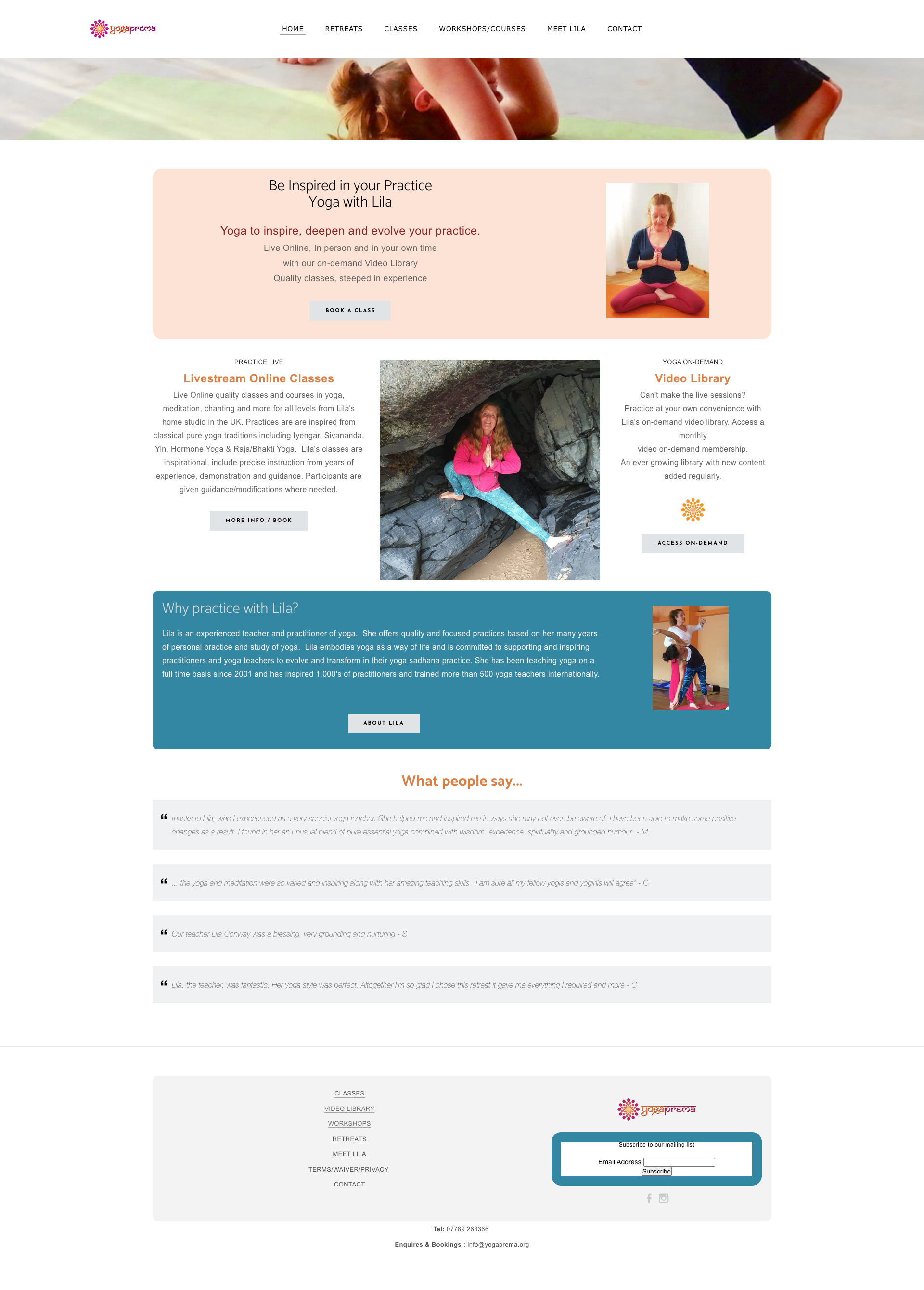
Lila’s old Weebly website
When Your Yoga Website No Longer Reflects Your Work
Lila's previous brand had served its purpose, but she had outgrown it. It no longer reflected where she was in her career or the quality of what she was offering. The visual identity felt generic — easy to overlook in a crowded wellness space — and didn't communicate the thirty years of lived experience, traditional study and genuine devotion behind her work.
She was also at a significant moment personally. After a period away, she was ready to re-emerge. Ready to be seen. Ready to invest in something that honoured the depth of what she offers and gave her the confidence to promote it properly — starting with her upcoming retreats.
The brief was clear: this couldn't look like every other yoga website. It needed to feel warm, grounded and quietly powerful. Not soft or generic. More like a woman who has genuinely walked the path she teaches.
Brand Identity and Squarespace Website Design for a UK Yoga Teacher and Retreat Leader
We started with brand strategy — the thinking that happens before a single colour or font gets chosen. This stage is where we got clear on who Lila is, who she's speaking to, what makes her the natural choice for her people, and the transformation her students experience. That foundation shaped every visual decision that followed.
For the brand identity, we developed a logo built around an arch shape — a nod to the sacred doorways and temple architecture of India that have been central to Lila's path. The icon features a heart opening into petals, representing growth, expansion and the gradual unfolding of yoga practice. The filled, solid version of the icon gives it real weight and presence, especially at smaller sizes on screen and print.
The colour palette was carefully considered to feel distinctive without being loud. Cream and raw linen form the spacious foundation. A warm, rich terracotta brings earthy depth. Dusky pink is used lightly as a supporting tone. And true marigold — not caramel, not ochre, but the flower itself — runs through the brand as a small, intentional spark of energy and warmth. No green. Nothing that could belong to a generic wellness brand.
Typography was chosen to carry the same quiet confidence as the icon — clean, spacious, warm but with real presence. The heading font has enough character to be distinctive and memorable without being decorative or fussy.
The Squarespace website brings all of this together into something spacious, easy to navigate and deeply rooted in Lila's own photography — shot specifically for this project — which captures the softness, strength and devotional quality of her work beautifully. The site includes her retreat pages for Kerala and Kefalonia, an online practice space housing her video library of recorded classes, information about her immersion programmes, and a warm, unhurried about page that tells the story of her path from London to India and back again.
Throughout the build, the guiding principle was the same as the brand brief: nothing that doesn't belong. Spacious over cluttered. Depth over decoration. A site that feels like stepping into her world, not scanning a services menu.
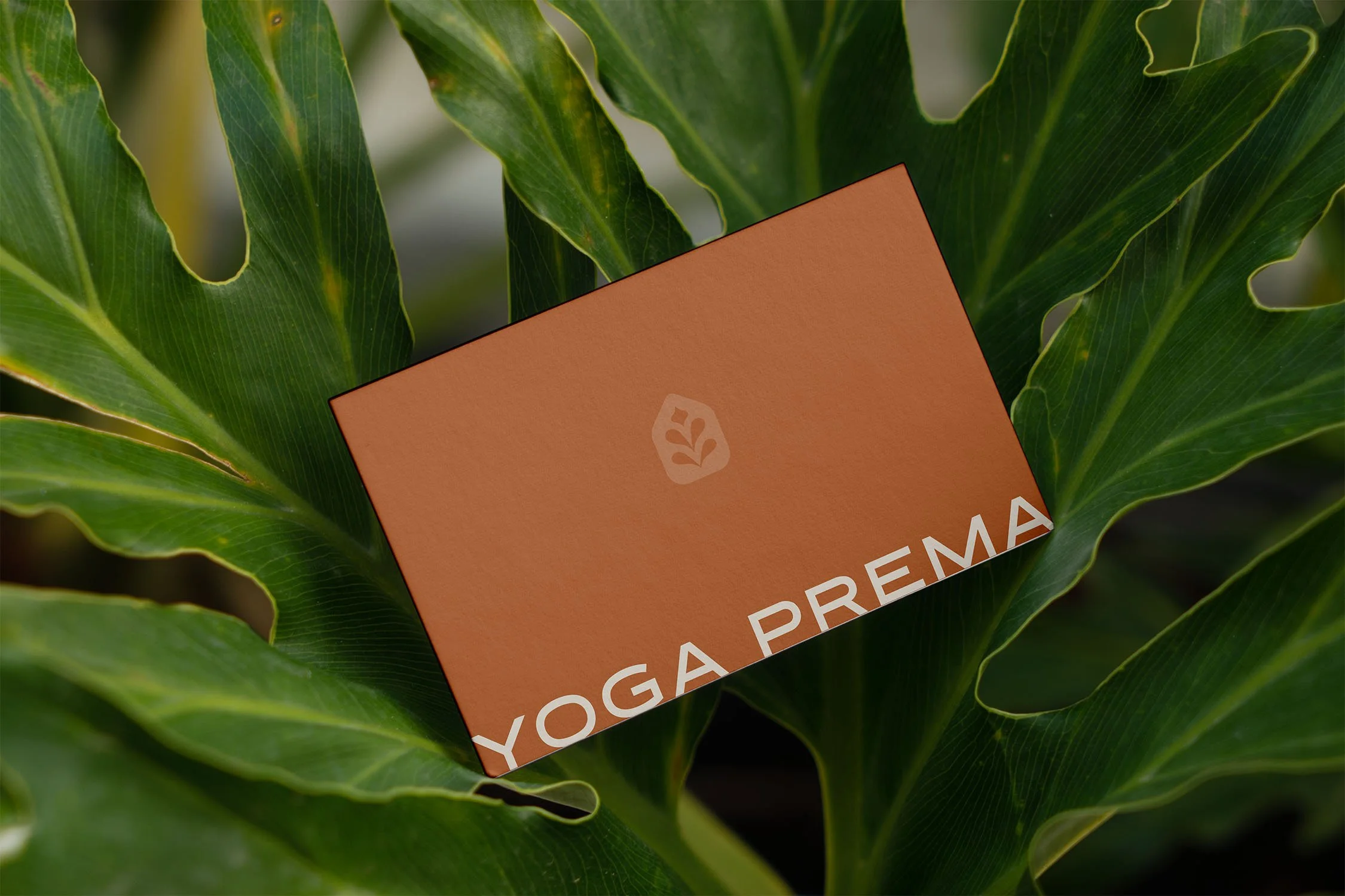
New branding for Yoga Prema
The Finished Brand Identity and Website
The Yoga Prema brand and website is warm, distinctive and quietly powerful — everything Lila's work has always been, now finally visible online. The arch icon is immediately recognisable and carries real presence at every size. The palette feels earthy and alive without tipping into the generic yoga aesthetic. The site is calm and easy to navigate, with her photography doing much of the emotional heavy lifting.
Most importantly, it looks and feels like her.

New website for Yoga Prema
From Hiding to Visible: How the Right Brand Changed Everything
In Lila's own words:
"I can fully recommend working with Heather. She has a real gift for listening deeply and translating the heart of someone's work into something beautiful, clear and professional. I felt supported throughout the whole process, and really appreciated her patience, care, creativity and eye for detail.
She also kept the vision on track, which was so helpful. She didn't just add things in for the sake of it — she helped keep the website spacious, aligned and true to the feeling we were creating.
I'm so pleased with the final result. The website feels elegant, grounded, easy to navigate and, most importantly, it finally feels like me and my work."
Looking for Squarespace Website Design for Your Yoga or Wellness Business?
If you're a yoga teacher, retreat leader or wellness practitioner who has outgrown your current brand — or never had one that truly reflected your work — I'd love to hear from you.